How to design a dark theme user interface
Feifei Zhou
August 19, 2022
Hi everyone! In this blog I go through the best practices on how to design a dark theme user interface. I will show you a step by step process, which is based on Google Material Design and guidelines by Apple. Examples and helpful links are included 😄
Why a dark theme?
Before designing anything it is good to think about why and how you want to use a dark theme. Are you providing the dark theme as a secondary option or will it be the default theme? Netflix has a dark color palette, because we most likely use it in low light environments. A dark theme also puts the focus on content – for example in the Spotify application, where the bright images stand out. If a dark theme does not fit your brand or use case, you can always provide it as secondary option because it has some benefits:
- Dark themes save lives (battery lives).
- They reduce eye strain in low light environments.
- Screen glare is reduced and thereby minimizes blue light.
Be aware that a dark theme could cause eye strain in bright light conditions, especially if users look at the interface for a longer time.
Part 1: Choosing the right surface colors 🔲🔳
Use a dark gray instead of true black
One aspect that is very important when choosing the right colors for a design, is creating enough contrast while reducing eye strain. This applies to all color palettes, whether light or dark. True white (#FFFFFF) on true black (#000000) – or the other way around – creates a high contrast, but is not comfortable for our eyes. When designing a dark theme, it is recommended to use dark gray as a primary background color (Google recommends #121212).
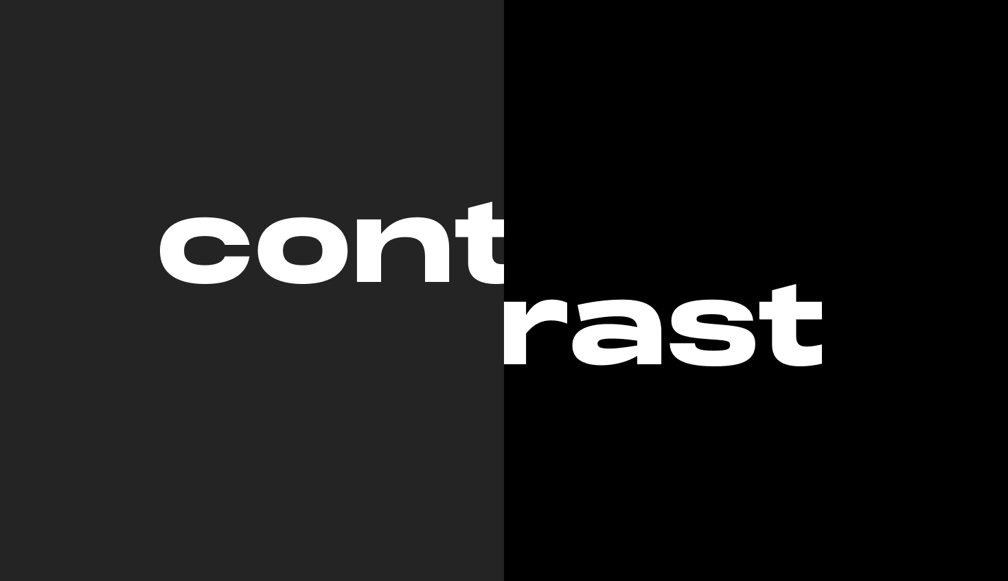
As you can see, white text on a dark gray surface has less contrast than white text on a true black surface and is therefore more comfortable for the eyes. This will be especially noticeable with longer areas of text. However, make sure there is enough contrast to meet the accessibility standards outlined in the WCAG 2.0. (don’t worry for now, more of this in part 2).
Elevation
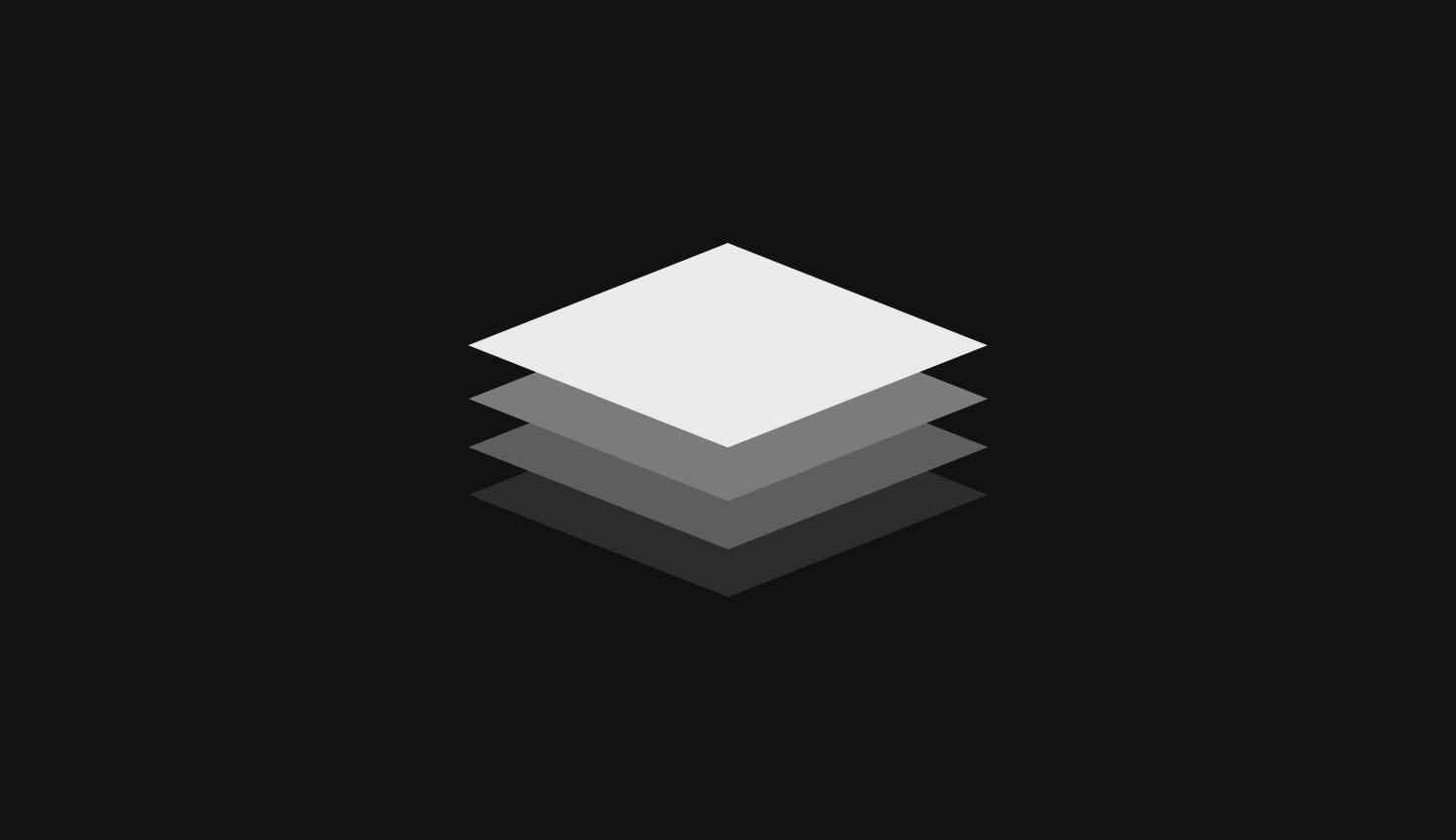
Elevation is the relative distance between components along the z-axis. For a dark theme Google advises to use a lighter surface color to indicate that a component is ‘on top’ of the other.
This means that you need to create different shades (lighter) from your base surface color (primary background color). You could copy the colors for 10 levels of elevation from Google Material Design or create them yourself.
A good way to do this is using a white overlay on your base surface color and play with the transparency.
Background and surfaces with a brand color
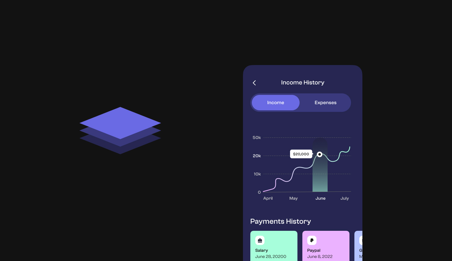
Dark themes don’t necessarily have to be black and gray only. If you are in love with your brand color, there are ways to translate this to your dark theme. In the example below we have a purple color as our brand color. To make a dark version of this we give it an opacity of 12% on a black background. This results in the darker purple used on the background of our app.
The steps to follow
- Decide whether you want a gray background color or a dark version of your brand color.
- Create different shades from the background color for elevated components.
Part 2: Add some colors 🌈
The color palette explained
In part 1 we discussed the background color and surface colors. The next step is to choose a primary color that represents your brand. When you have your desired color it is time to create a color palette with the help of this color picking tool.
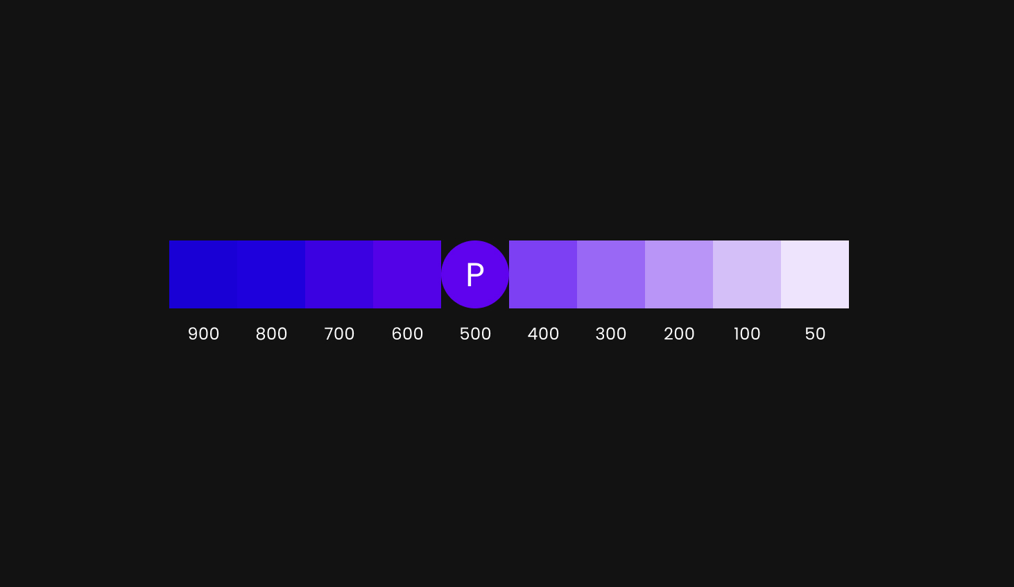
Ok, so what are we looking at here?
The ‘P’ stands for your chosen primary color. Based on the primary color the tool creates different shades by increasing and decreasing the saturation. Each shade is assigned with a number from 50-900. These numbers are tonal values and are used to identify a certain shade. In the example above the primary color has a tonal value of 500.
This is how you can use the generated shades:
- Choose one or more primary variant colors (any other color than the primary color). Variant colors can be used to create more diversity in your interface.
- Choose a color that works well in dark themes (anything from 50 to 400). High saturated colors don’t create enough contrast on a dark background.
So now you have a background color, surface colors and a primary color. Optionally, you can expand this with a secondary color, accent colors and an error color. In this case you can follow the same steps as we did with the primary color.
'On' colors
'On' colors are applied to text, icons and strokes that are placed on top of surfaces that use one of the base colors.
It’s important that there is enough contrast between the 'on; colors and the surface colors. Material Design suggests a white color on dark backgrounds and a black color on the primary color(s). You could also use one of your brand colors on a dark background, as long as it’s creating enough contrast.
Meet the minimum contrast levels
There are many people who are visually impaired and have less than 20/20 vision. For your interface to be accessible it is important to meet the contrast ratios.
I will explain the next 4 scenarios and which minimum contrast ratios you have to meet in each case:
- White text on a default dark background.
- White text on a colored dark background.
- A non-white color on a default dark background.
- A non-white color on a colored dark background.
These are the tools that you can use to test the contrast ratios. When testing, make sure you test the 'on' colors with the lightest shade of your surface color.
Let’s go!
-
White text on a default dark background
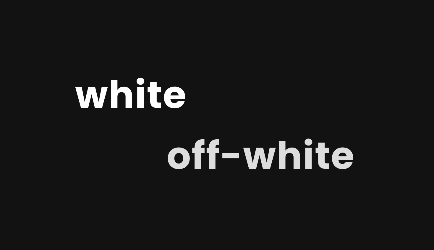 White text on a dark background can either be 100% white or a slightly darker white. These are the minimum contrast levels:
- For 100% white: you don’t need to test.
- For darker variations of white: 4.5:1 contrast ratio (exception: disabled state)
-
White text on a colored dark background
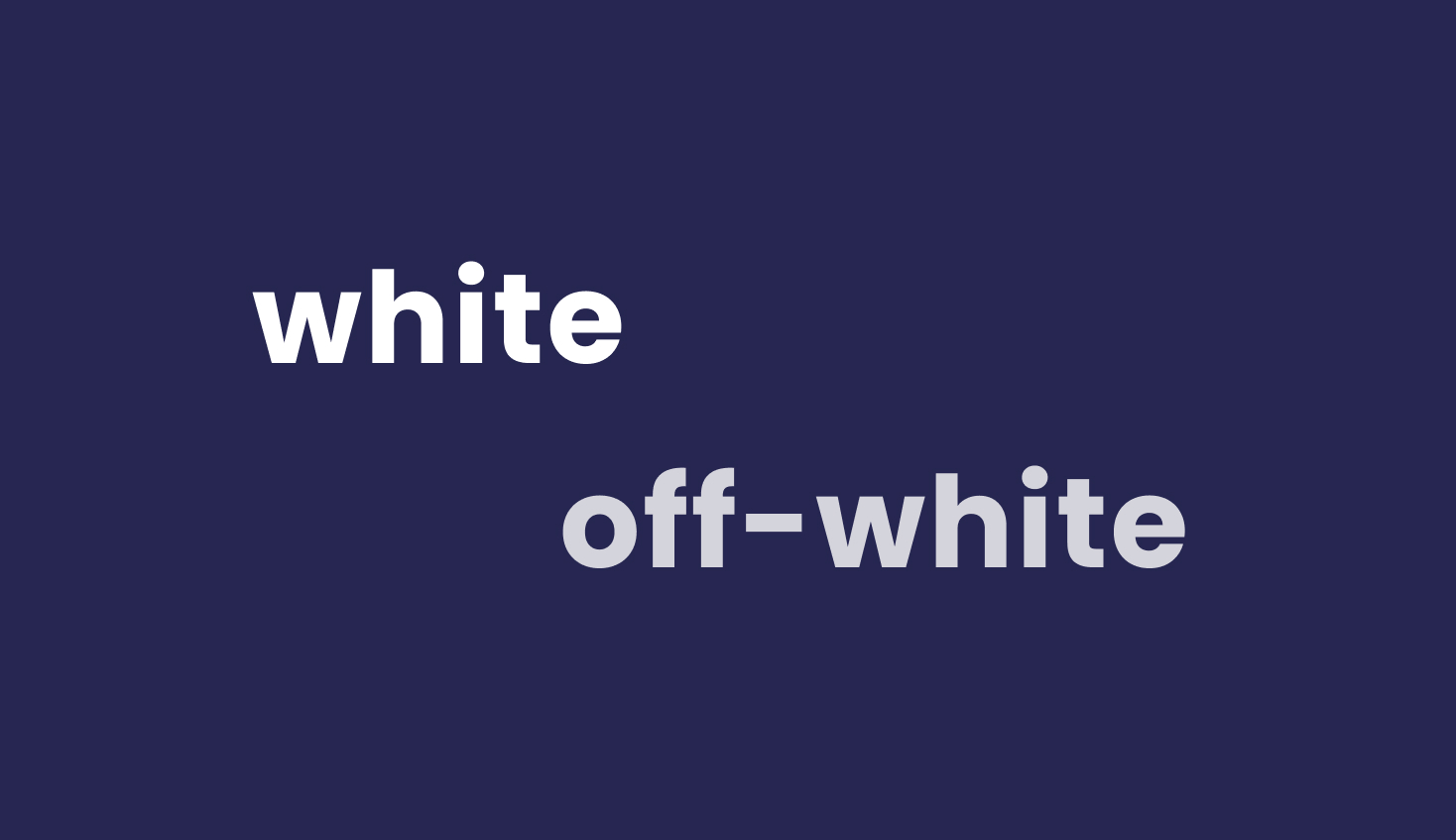 White text on a colored dark background can also be 100% white or a slightly darker white. This is the minimum contrast level in both cases: 15.8:1 contrast ratio.
 -
Non-white text on a default dark background
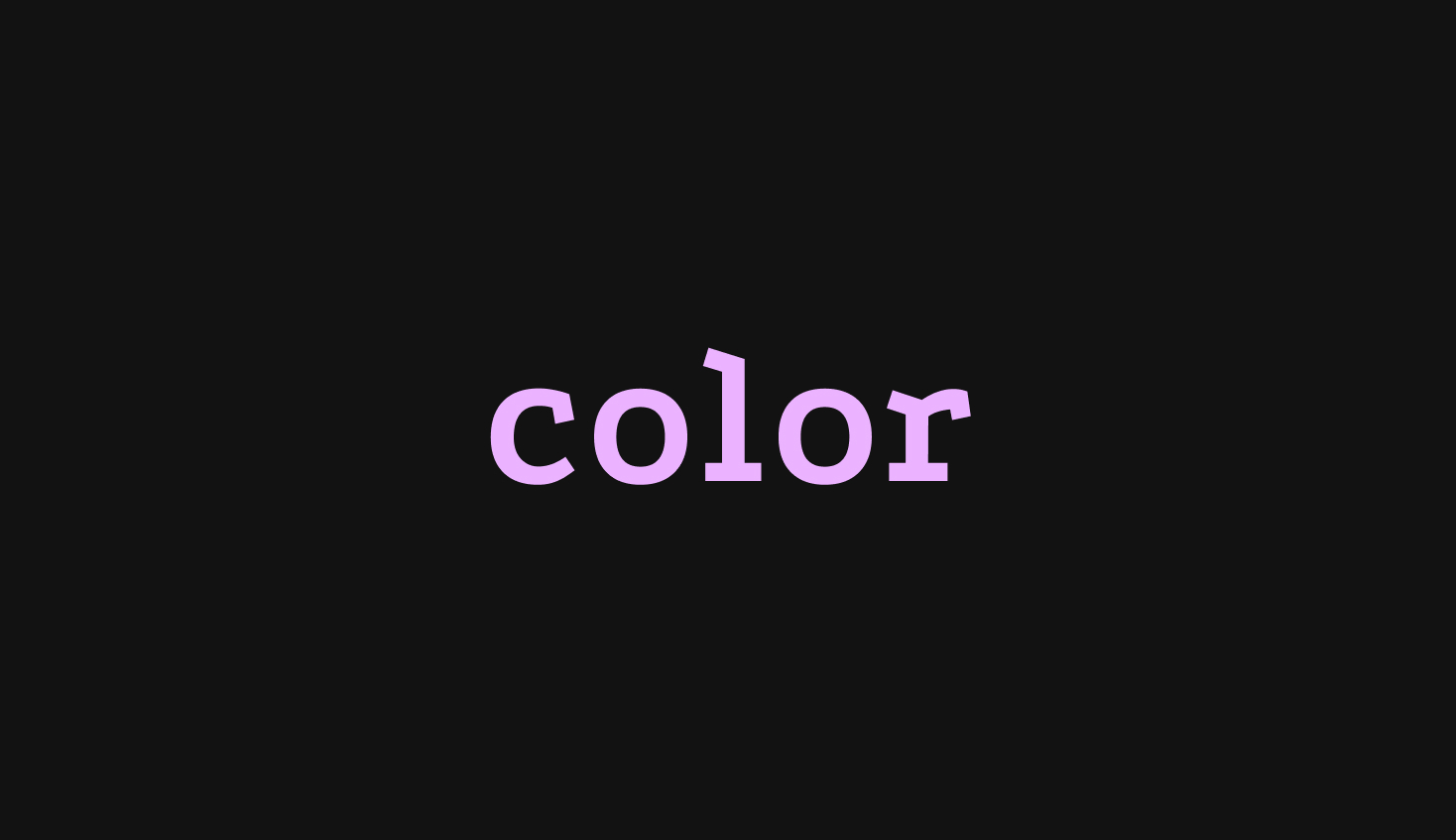 Any non-white text on a default dark background should meet the minimum 4.5:1 contrast ratio.
 -
Non-white text on a colored dark background
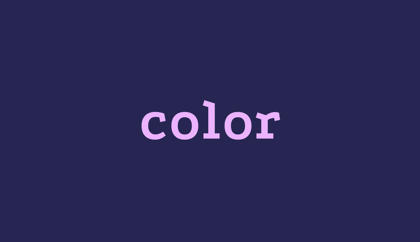 Any non-white text on a colored dark background should meet the minimum 4.5:1 contrast ratio.
And lastly... Always test with both designs
Apple recommends testing on how the user interface looks in both light and dark appearances. Some assets, illustrations and images that work well in one appearance might not work in the other. If it is needed, tweak the colors and make two versions. Furthermore, consider providing a switch, so users can always see their preferred theme.